Using a slicer, you can turn your dashboard into an interactive experience, enabling your users to quickly filter different values.
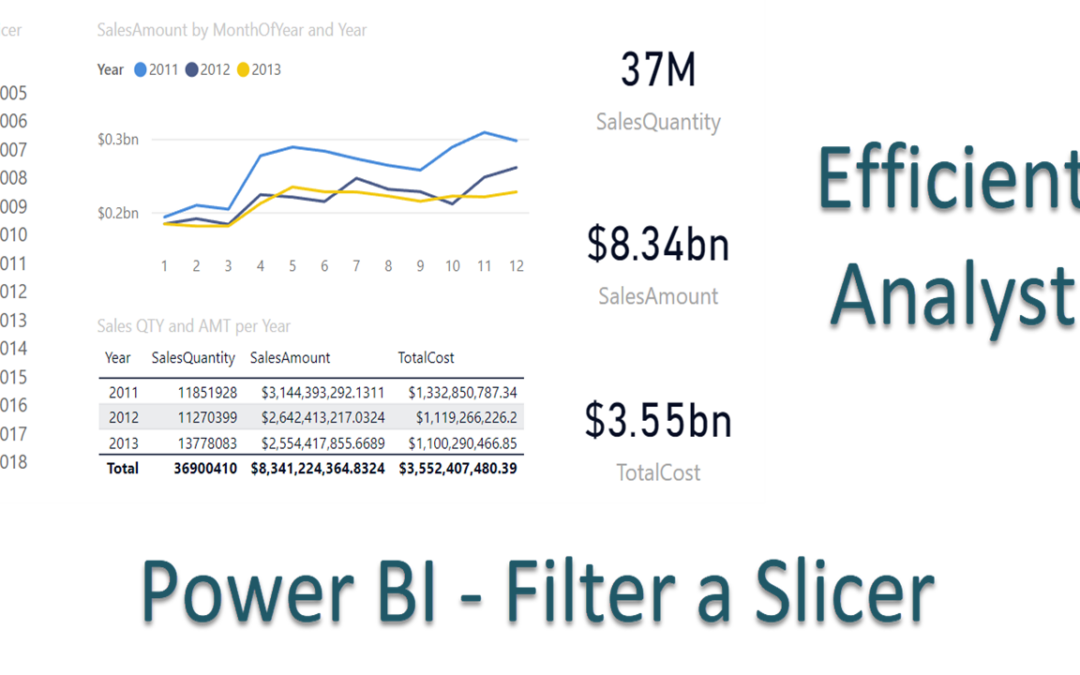
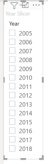
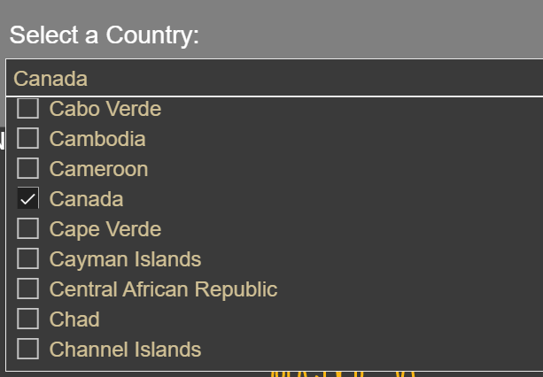
If you use a dimensional model as the source of your Power BI model, chances are at some point you will want to use a dimension such as your Calendar, Customer, or Production dimension to in a slicer to filter data on a page. For the most part, that will work well, but what if your Calendar dimension contains many more years of data than your Sales fact, such as in the example below?
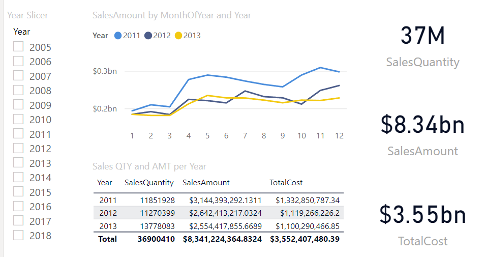
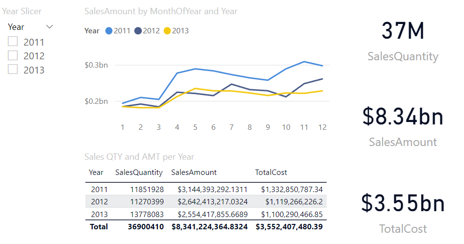
In this example, you will notice the Sales table only has sales for years 2011, 2012, and 2013, but the Year Slicer shows years from 2005 to 2018. While this can work, in this post we will show you how to clean this up to only show the years which have sales associate to them.
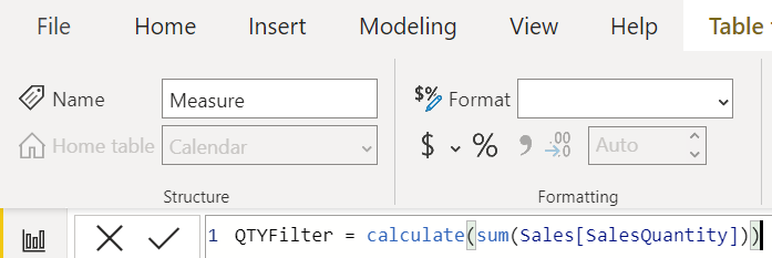
Create a New Measure in your Calendar Table
Using the Calculate() function, we will create a measure in the Calendar table that sums up the Sales Quantity per date. QTYFilter = calculate(sum(Sales[SalesQuantity]))
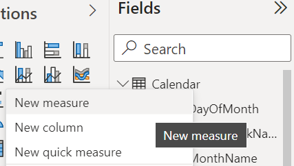
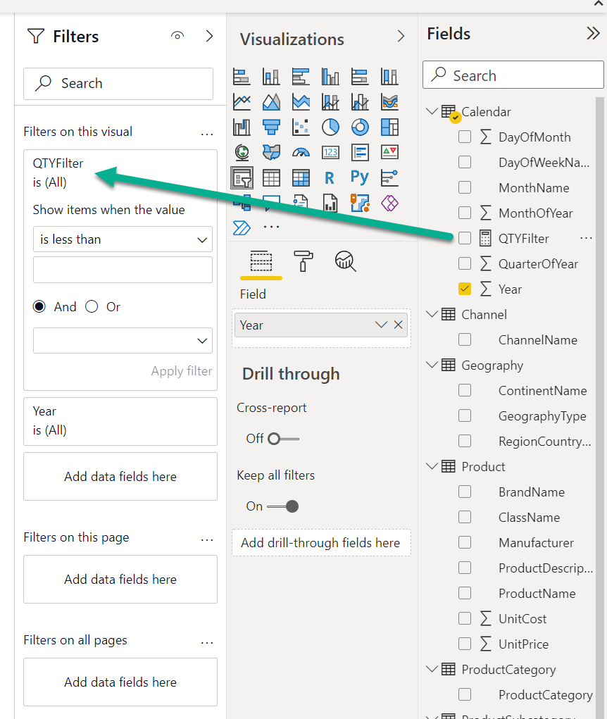
Right-click the Calendar table and select New Measure.
Type in the formula for the metric you want to filter by. In this case we will use the Sales Quantity: QTYFilter = calculate(sum(Sales[SalesQuantity])).
Use the QTYFilter Measure to Filter the Year Slicer
Select the Year slicer.
In the Filters pane, drag the QTYFilter measure to the Filters on this Visual section.
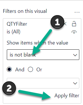
In the Drop Down box, select is not blank, and click Apply filter.
As you can see, the Year slicer now only contains years where there was a sales quantity, giving you a much cleaner slicer.
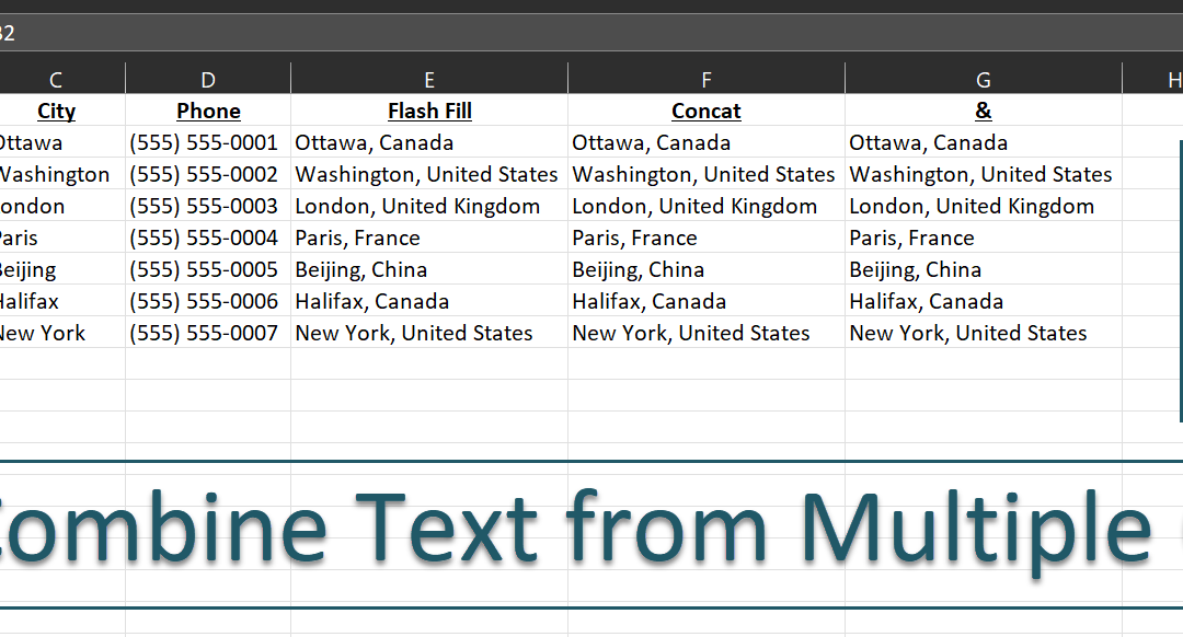
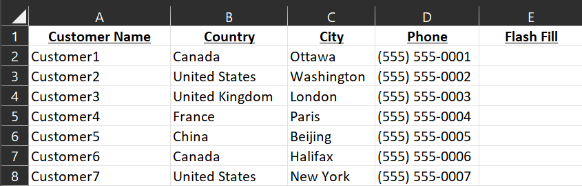
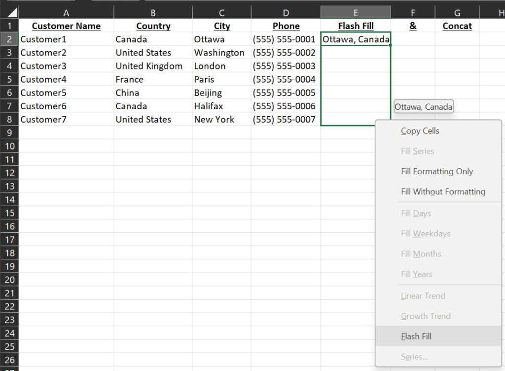
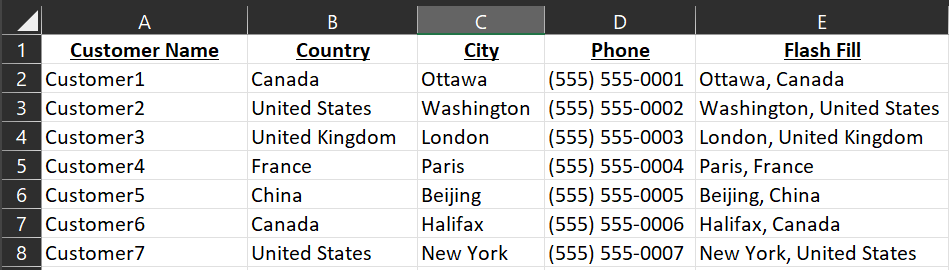
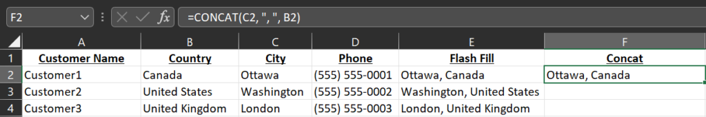
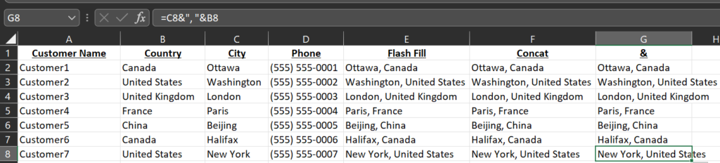
Today we will explore 3 ways of quickly combine text from multiple columns in Excel. In this example, we will combine the name of the City and the Country, while adding a comma in between. For example Ottawa, Canada.
Combine Text from Multiple Columns using Flash Fill
Excel 2013 introduced a new feature called flash fill, which seems to be getting better with every new release. Using the Customers – Exercise Book tab, we will be filling in column E, titled Flash Fill.
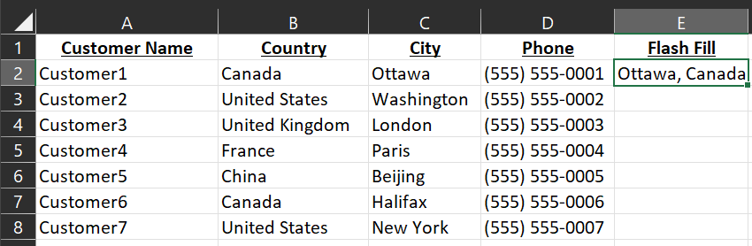
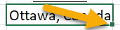
In cell E2, we will write the results how we would like to see them, in this case we will write Ottawa, Canada.
Next, we will select cell E2, and you can either press Control+E to fill in the rest of the column automatically, or you can right-click and hold the square in the bottom-right, and drag your mouse to the bottom of the table, as we can see here:
Select Flash Fill in the drop-down that appears. Excel’s AI will automatically fill in the rest.
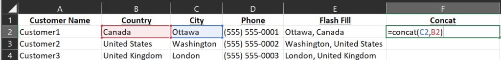
Combine Text from Multiple Columns Using the Concat() function
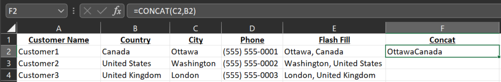
The Concat function can be used to combine data from multiple columns. In column F, we will do a quick formula to show how it works. We will start with concat(C2, B2), which will combine cells C2 and B2 together.
The end result is not quite what we want. As you can see, it squished both cells together, which we will fix next.
We will fix this by adding the text we want as a separator by using “, ” as follows: concat(C2, “, “, B2). As you can see, this formats the text as we expect it: Ottawa, Canada.
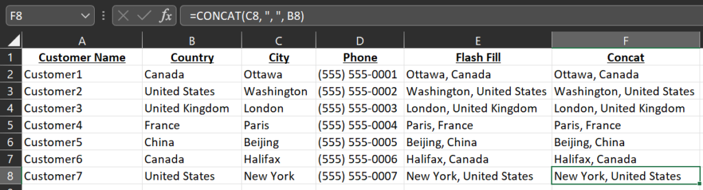
As always, you can drag the formula down by left-clicking the square in the bottom-right of cell F2 and dragging it to the bottom of the table to fill in the other cells automatically.
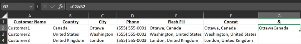
Combine Text from Multiple Columns Using &
The last method we will see today is the one I actually use the most, which uses the & instead of the concat() function. To begin, in G2, we will write =C2&B2. Again you will notice that we get OttawaCanada all bunched up together. We will fix this in the next step.
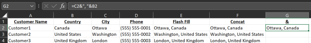
As we did with the concat() function, we will use “, ” to add a comma and a space between the City and Country, giving us the following formula: =C2&”, “&B2.
As always, you can left-click the square in the bottom right of the cell to drag down the formula to fill in the City, Country for the rest of the table.
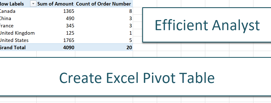
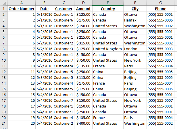
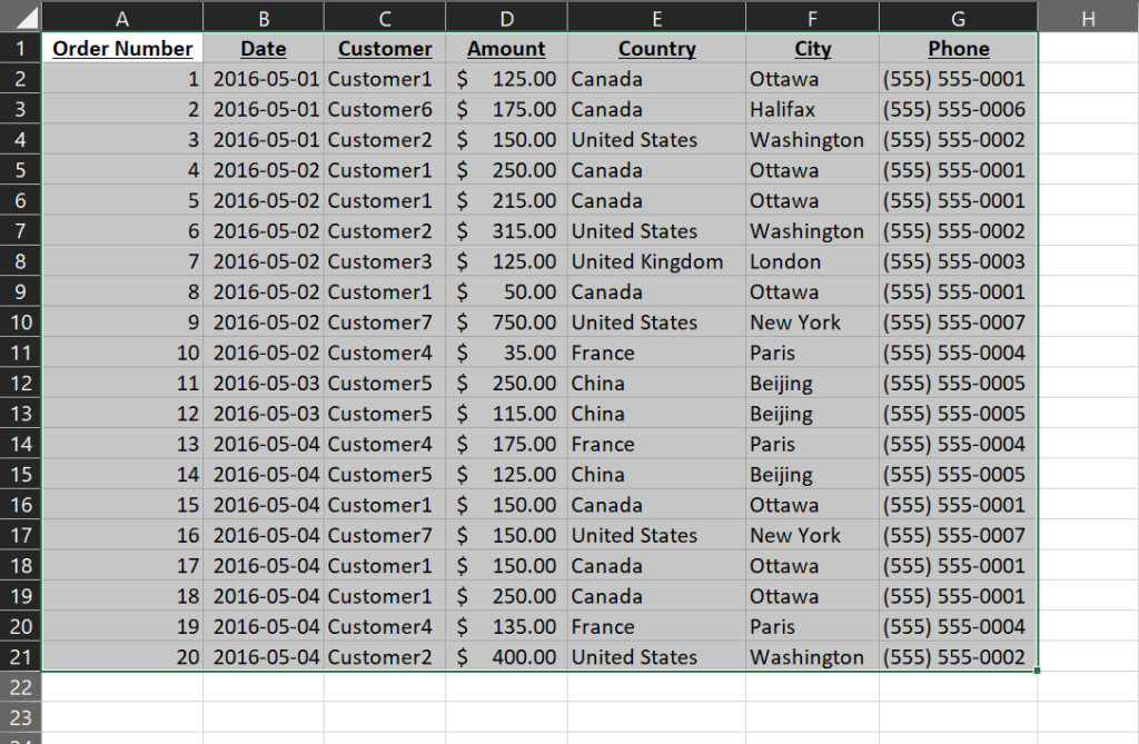
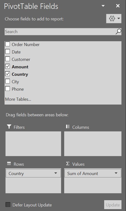
As an example of how the Excel Pivot Table feature works, let’s take a simple excel workbook with the following two tabs: Orders and Customers.
The Orders tab contains an order number, date, customer name, and amount. For the purposes of this exercise, we won’t be using the Customers tab.
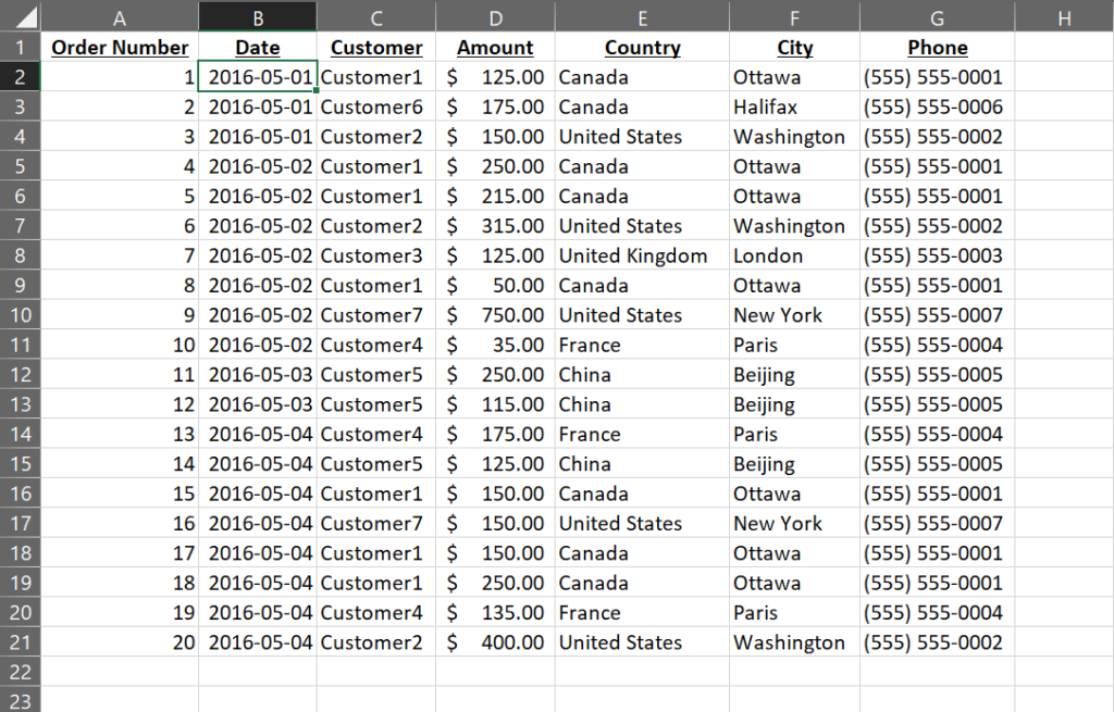
To begin, select the entire table, from cell A1 through to cell G21, or click on any cell within that range.
Or
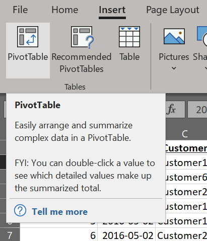
In the Insert ribbon, click the Pivot Table button.
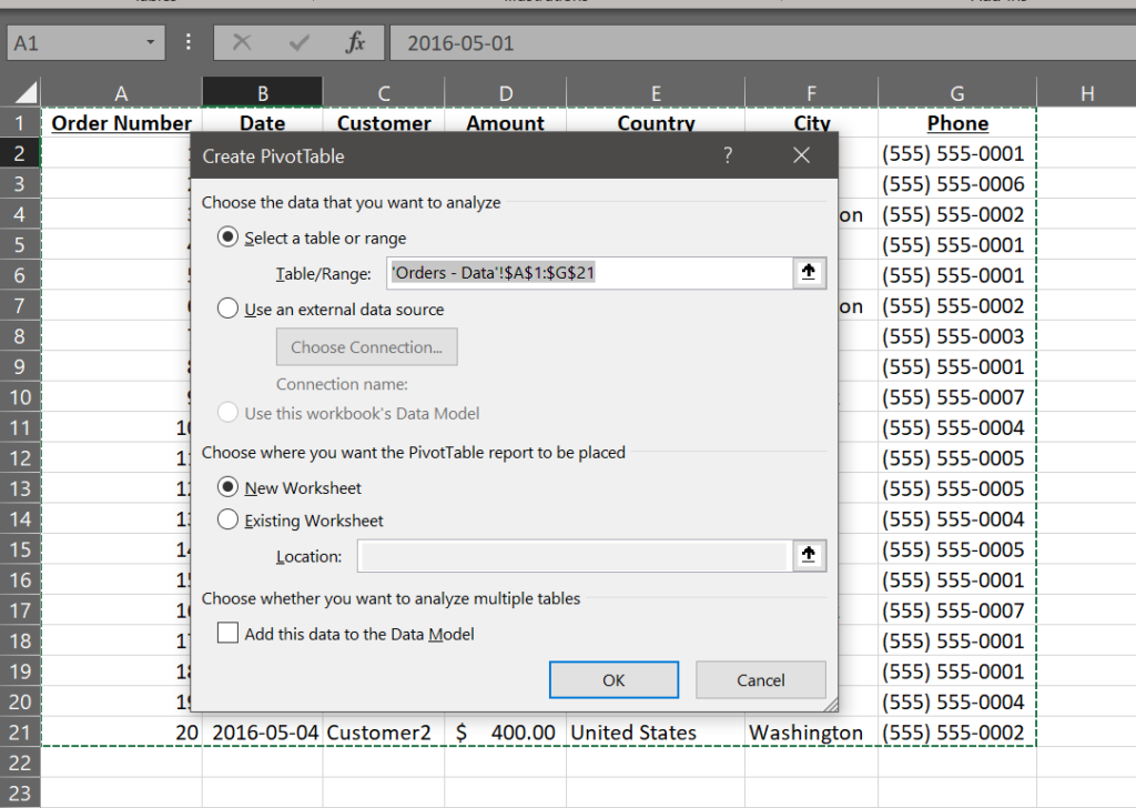
The Create PivotTable window will appear which shows the table/range that will be used as the input for the Pivot Table, and where you want the pivot table to be added.
In this case, we will keep the default, and use New Worksheet. Press OK to continue.
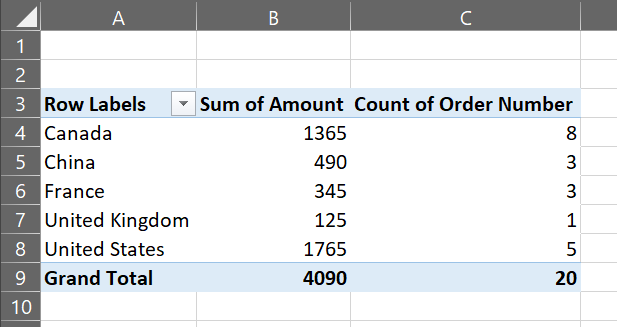
In the PivotTable Fields area, click and drag the Country field to the Rows section, and the Amount to the Values section. You will notice that Excel automatically notices the Amounts column contains numbers, so it will give you the sum.
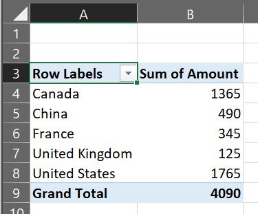
Notice the results are now displayed on the left.
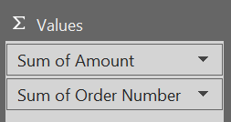
To add the count of orders, we will drag the Order Number field to the Values section also. Notice how Excel also detects the Order Number as a number, so chooses to aggregate with a sum. We will fix that shortly.
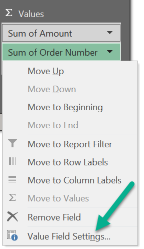
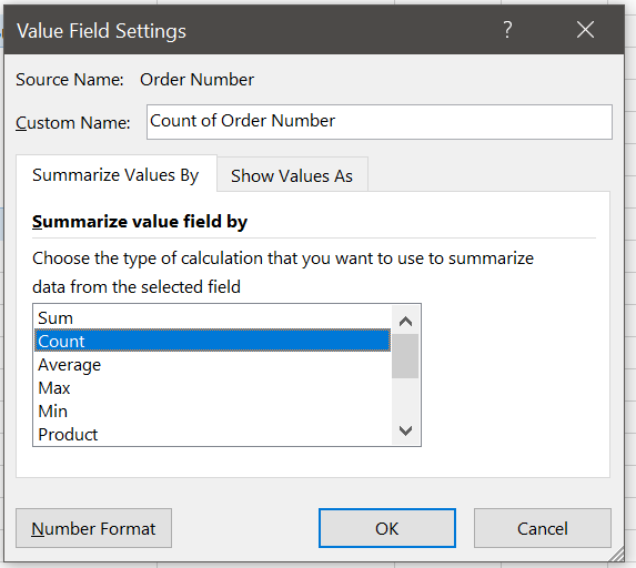
Click the triangle next to the Sum of Order Number, and select the Value Field Settings… menu option.
In the Value Field Settings window, select Count. This will rename the Custom Name as Count of Order Number.
Click OK to apply the changes, and see the final results.
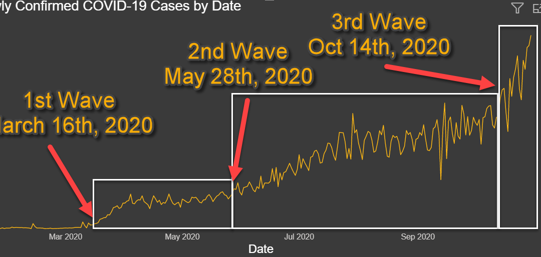
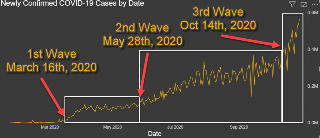
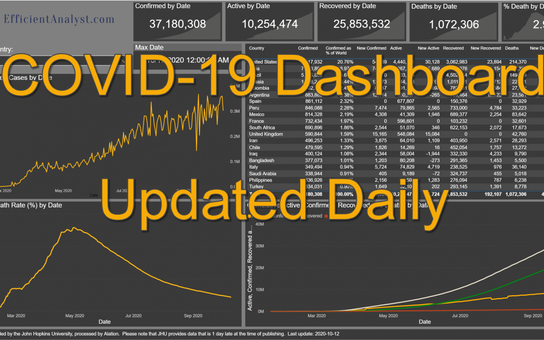
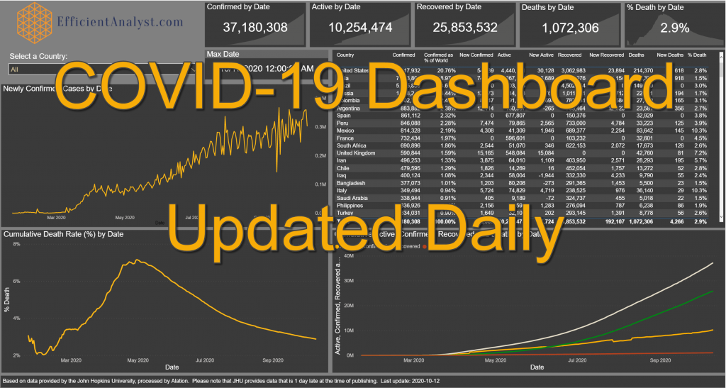
In this post, I want to discuss the concept of Coronavirus Waves. Waves can be best shown graphically, where we can visually see how many new cases are confirmed each day. As we can see from the below Graph representing how many new COVID-19 cases have been confirmed globally by date, I believe we can clearly see 3 distinct waves of the virus.
While comparisons between countries can be interesting, looking at waves can allow you to investigate how well various policies are working for a particular country. Something that works well for one country might not work well in another country, and often times countries try to balance health concerns and the impact on the economy.
The First Wave started around March 16th 2020 and continued until May 28th, 2020. We can see a period of acceleration and a clear plateau around the 75,000 to 100,000 new cases per day starting around April 1st.
The Second Wave started around May 28th and also featured a period of acceleration until around July 22th, where we can again see a plateau around the 200,000 to 360,000 new cases per day.
The Third Wave, of which we are still in the acceleration period, has already reached over 565,000 new cases in a day, and is not yet showing a sign of plateauing.
Some factors to take into consideration when analyzing COVID data is the graphs are only as good as the data. To get 100% accurate data, you would need every country to test 100% of the population daily and publish those numbers truthfully. As this is not possible, the numbers are usually under-represented. The more testing that is done in a region, the more likely The real number of confirmed cases is most likely higher. You also have countries that manipulate COVID-19 numbers for political reasons, usually under-reporting the data to appear to doing better. This can be done either reporting false data, or by making it it more difficult to get tested.
Each Country is Different
One important thing to note when looking at COVID-19 statistics, is that the spread in each Country can be very different. There can be many reasons for this, including different lock-down policies and compliance, the ability of each country to test adequately, including the availability of tests, the requirements to get tested, and the ease of testing (distance to nearest testing center, time commitment to get tested, stigma with being diagnosed, etc), and the willingness of each country to report truthful numbers.
We will look at two examples here, Canada and US, where we can see very different waves. Looking at other countries, we can also see similarities and differences between each country. It would be very interesting to see what factors contributed to keeping the cases low during some waves, and what factors favored the spread of the Coronavirus in other waves.
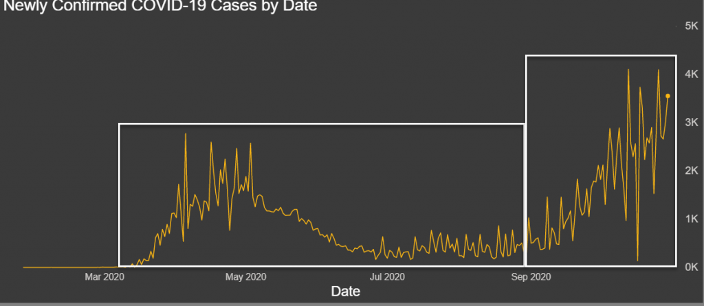
Canada COVID-19 waves
In the case of Canada, as we can see in today’s dashboard, it would probably be more appropriate of talking about two waves. As you can see, there was a wave in Spring and a current wave going on in Fall. We could argue if we should break it up in 3 waves also, a peak in Spring, a lull during the summer, and another peak in Fall. This would greatly depend on the type of analysis you want to do.
Canada Newly Confirmed Cases by Date
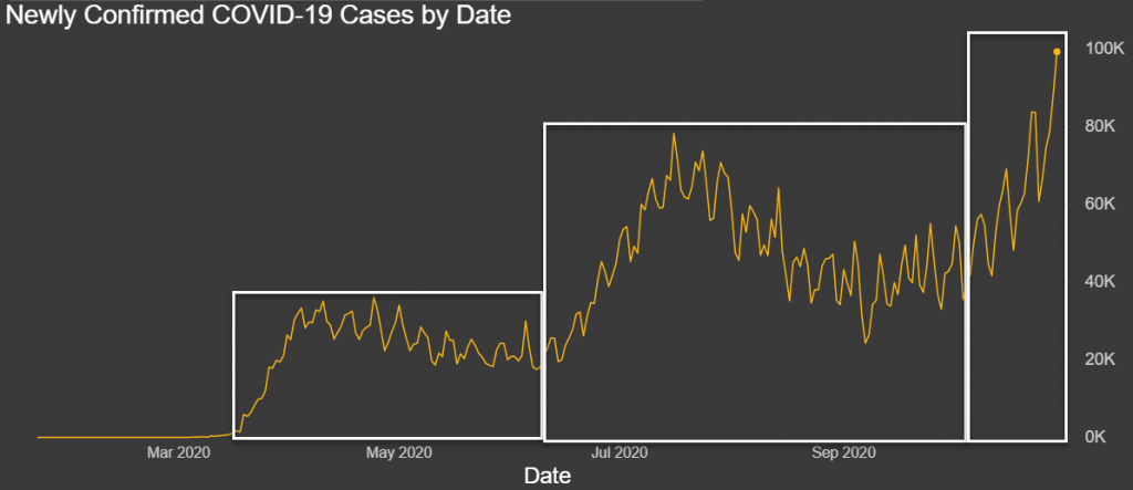
United States COVID-19 Waves
If you look at the graph for the United States, we can clearly see the three waves as we did in the global graph.
Introducing the newest version of my COVID-19 dashboards, now interactive! You can select a country in the top-left drop-down to show the KPIs and line charts for that country, or you can scroll down the grid on the right to see all the countries.
We use cookies to ensure that we give you the best experience on our website. If you continue to use this site we will assume that you are happy with it.

Recent Comments