
COVID-19 Canada
List of Resources
Links to official Canadian COVID-19 sites
- Canada: https://www.canada.ca/en/public-health/services/diseases/coronavirus-disease-covid-19.html
- Alberta: https://www.alberta.ca/coronavirus-info-for-albertans.aspx
- British Columbia: https://www2.gov.bc.ca/gov/content/safety/emergency-preparedness-response-recovery/covid-19-provincial-support
- New Brunswick: https://www2.gnb.ca/content/gnb/en/departments/ocmoh/cdc/content/respiratory_diseases/coronavirus.html
- Nunavut: https://www.gov.nu.ca/health/information/covid-19-novel-coronavirus
- Manitoba: https://www.gov.mb.ca/covid19/index.html
- Newfoundland: https://www.gov.nl.ca/covid-19/
- Northwest Territories: https://www.hss.gov.nt.ca/en/services/coronavirus-disease-covid-19
- Nova Scotia: https://novascotia.ca/coronavirus/
- Ontario: https://www.ontario.ca/page/2019-novel-coronavirus
- Prince Edward Island: https://www.princeedwardisland.ca/en/topic/covid-19
- Quebec (FR): https://www.quebec.ca/sante/problemes-de-sante/a-z/coronavirus-2019/situation-coronavirus-quebec/
- Quebec (EN): https://www.quebec.ca/en/health/health-issues/a-z/2019-coronavirus/situation-coronavirus-in-quebec/
- Saskatchewan: https://www.saskatchewan.ca/government/health-care-administration-and-provider-resources/treatment-procedures-and-guidelines/emerging-public-health-issues/2019-novel-coronavirus
- Yukon: https://yukon.ca/en/information-about-novel-coronavirus-yukoners
Dashboard updated every day around 9PM EST.
Should we start talking about a 3rd COVID-19 wave?
In this post, I want to discuss the concept of Coronavirus Waves. Waves can be best shown graphically, where we can visually see how many new cases are confirmed each day. As we can see from the below Graph representing how many new COVID-19 cases have been confirmed globally by date, I believe we can clearly see 3 distinct waves of the virus.
While comparisons between countries can be interesting, looking at waves can allow you to investigate how well various policies are working for a particular country. Something that works well for one country might not work well in another country, and often times countries try to balance health concerns and the impact on the economy.
For more information, and to see the rest of my dashboard, visit https://efficientanalyst.com/covid-19-world-dashboard/
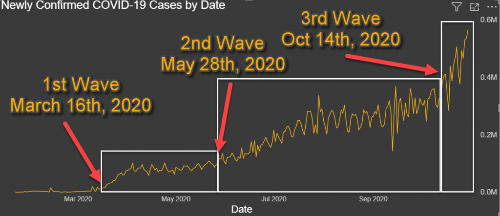
Three Global COVID-19 Waves
The First Wave started around March 16th 2020 and continued until May 28th, 2020. We can see a period of acceleration and a clear plateau around the 75,000 to 100,000 new cases per day starting around April 1st.
The Second Wave started around May 28th and also featured a period of acceleration until around July 22th, where we can again see a plateau around the 200,000 to 360,000 new cases per day.
The Third Wave, of which we are still in the acceleration period, has already reached over 565,000 new cases in a day, and is not yet showing a sign of plateauing.
Some factors to take into consideration when analyzing COVID data is the graphs are only as good as the data. To get 100% accurate data, you would need every country to test 100% of the population daily and publish those numbers truthfully. As this is not possible, the numbers are usually under-represented. The more testing that is done in a region, the more likely The real number of confirmed cases is most likely higher. You also have countries that manipulate COVID-19 numbers for political reasons, usually under-reporting the data to appear to doing better. This can be done either reporting false data, or by making it it more difficult to get tested.
Each Country is Different
One important thing to note when looking at COVID-19 statistics, is that the spread in each Country can be very different. There can be many reasons for this, including different lock-down policies and compliance, the ability of each country to test adequately, including the availability of tests, the requirements to get tested, and the ease of testing (distance to nearest testing center, time commitment to get tested, stigma with being diagnosed, etc), and the willingness of each country to report truthful numbers.
We will look at two examples here, Canada and US, where we can see very different waves. Looking at other countries, we can also see similarities and differences between each country. It would be very interesting to see what factors contributed to keeping the cases low during some waves, and what factors favored the spread of the Coronavirus in other waves.
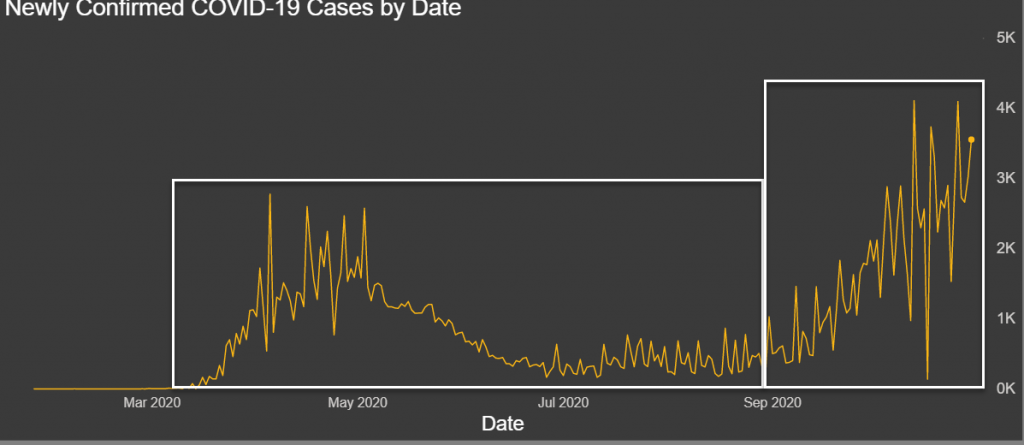
Canada COVID-19 waves
In the case of Canada, as we can see in today’s dashboard, it would probably be more appropriate of talking about two waves. As you can see, there was a wave in Spring and a current wave going on in Fall. We could argue if we should break it up in 3 waves also, a peak in Spring, a lull during the summer, and another peak in Fall. This would greatly depend on the type of analysis you want to do.
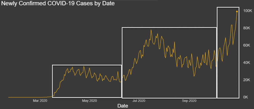
United States COVID-19 Waves
If you look at the graph for the United States, we can clearly see the three waves as we did in the global graph.
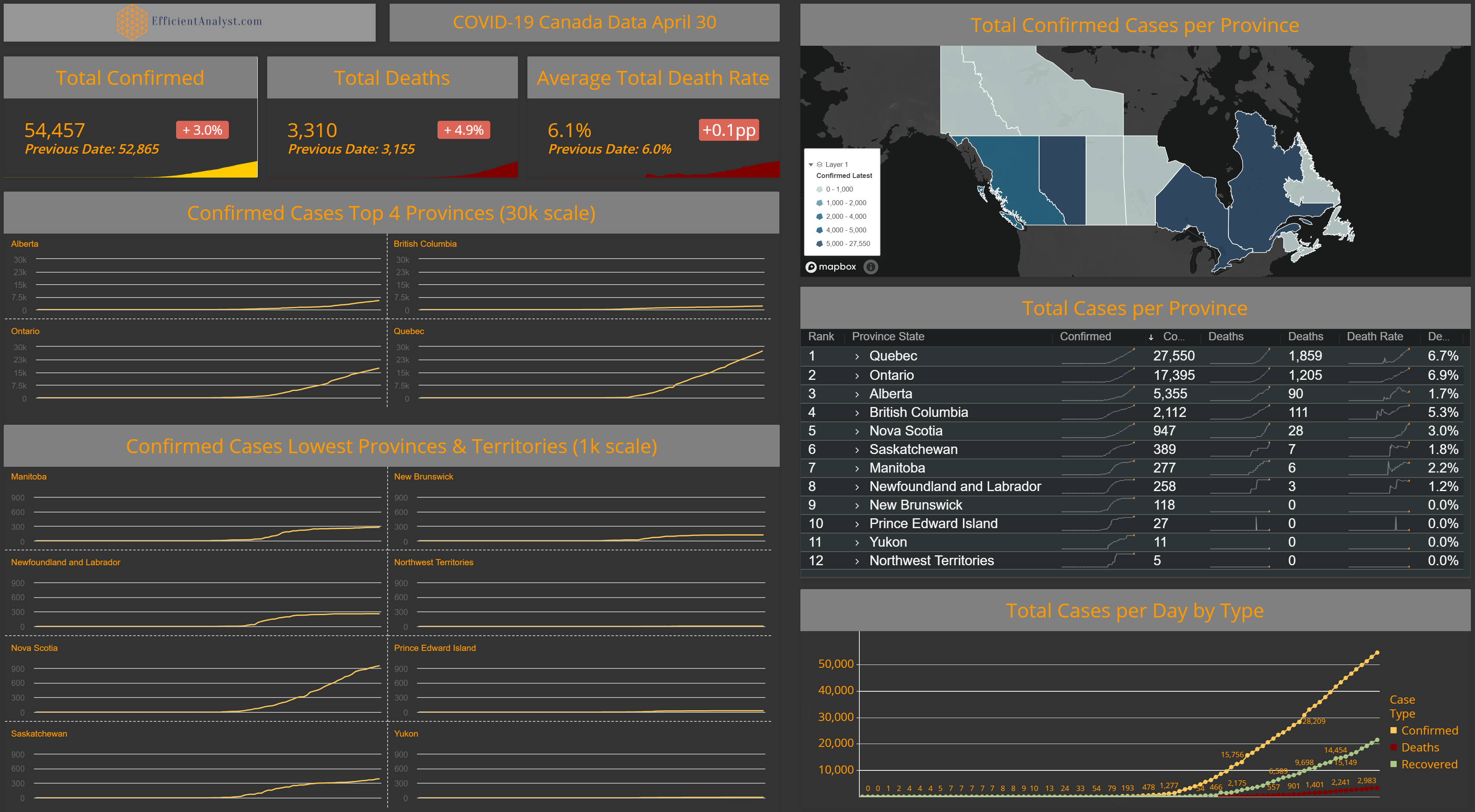
COVID-19 Canada April 30, 2020 update
COVID-19 Weekly updates
Due to inconsistencies with the data sources at John Hopkins University, I will be providing weekly updates instead of the daily updates. This will ensure I can validate the data against other sources. Next update is planned late Saturday night April 18th.
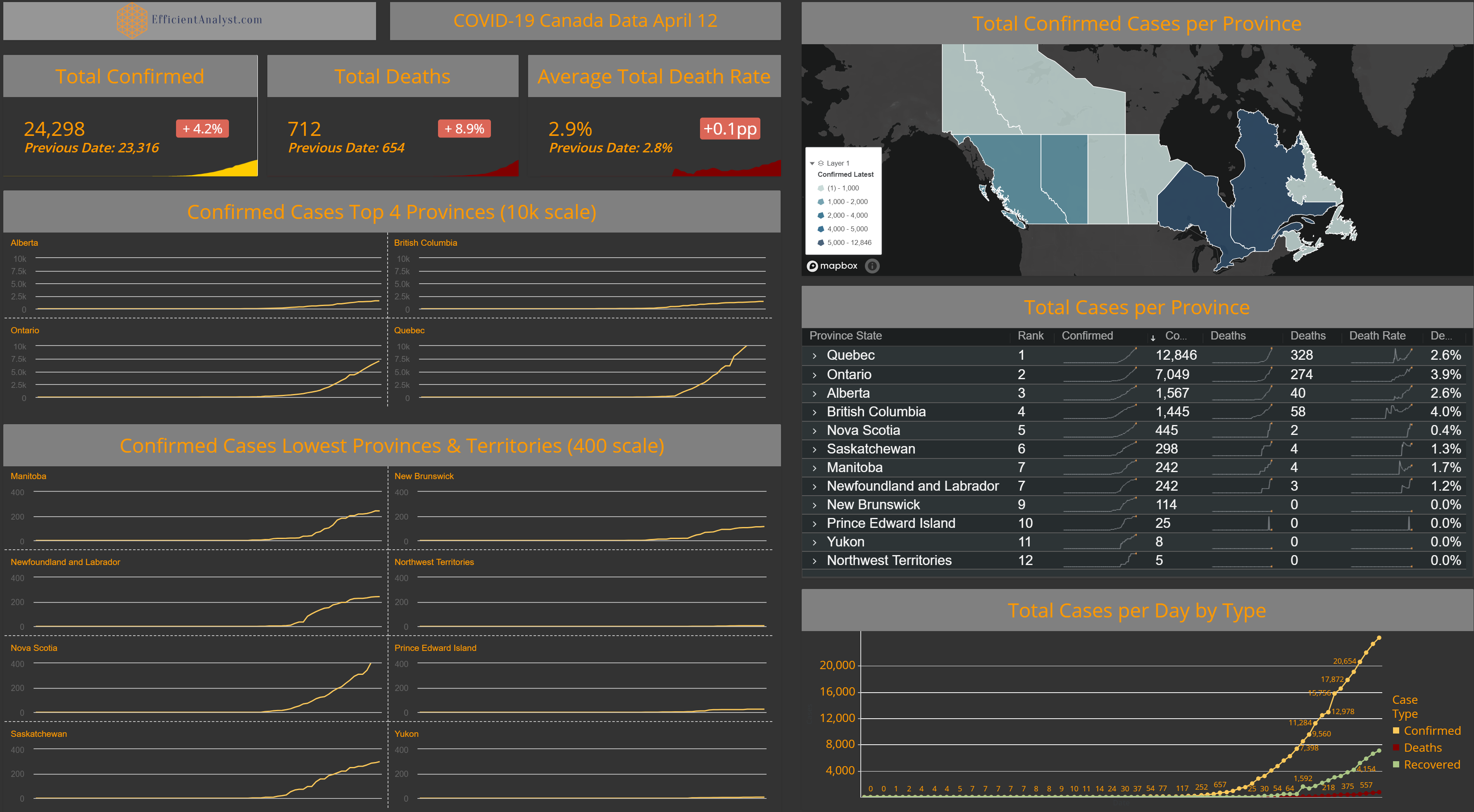
COVID-19 Canada April 12, 2020 update
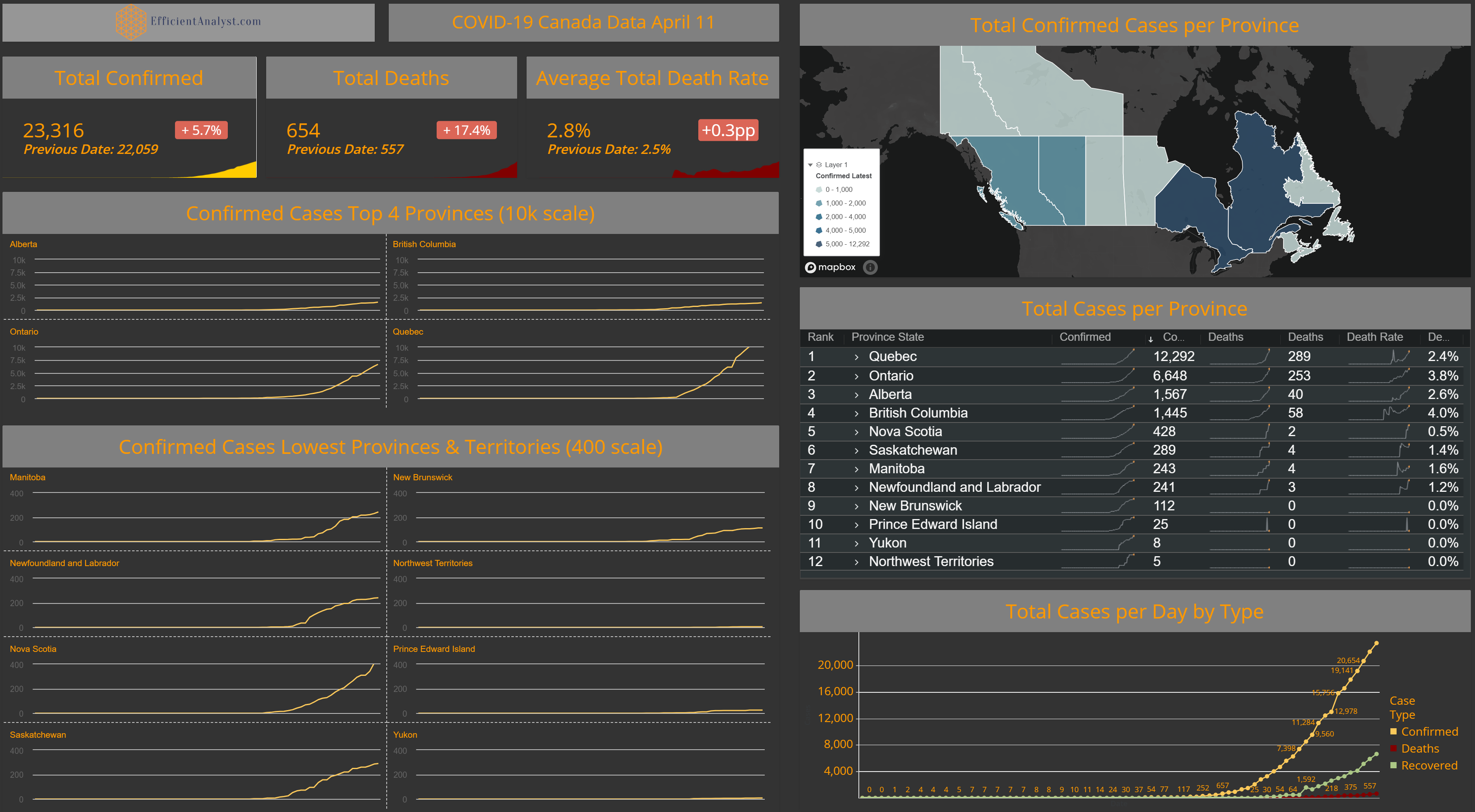
COVID-19 Canada April 11, 2020 update
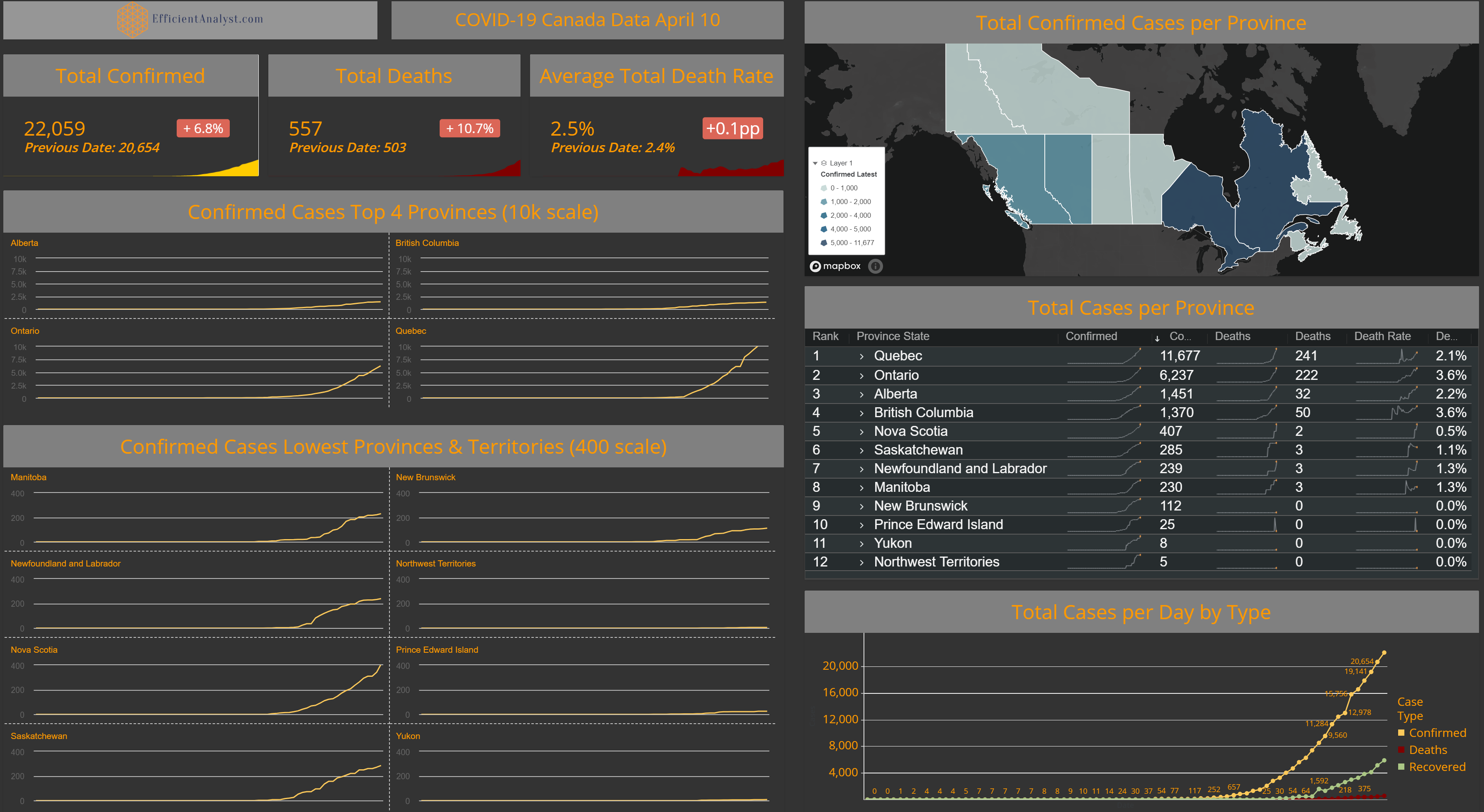
COVID-19 Canada April 10, 2020 update
COVID-19 Canada April 9, 2020 update

COVID-19 Canada April 8, 2020 update

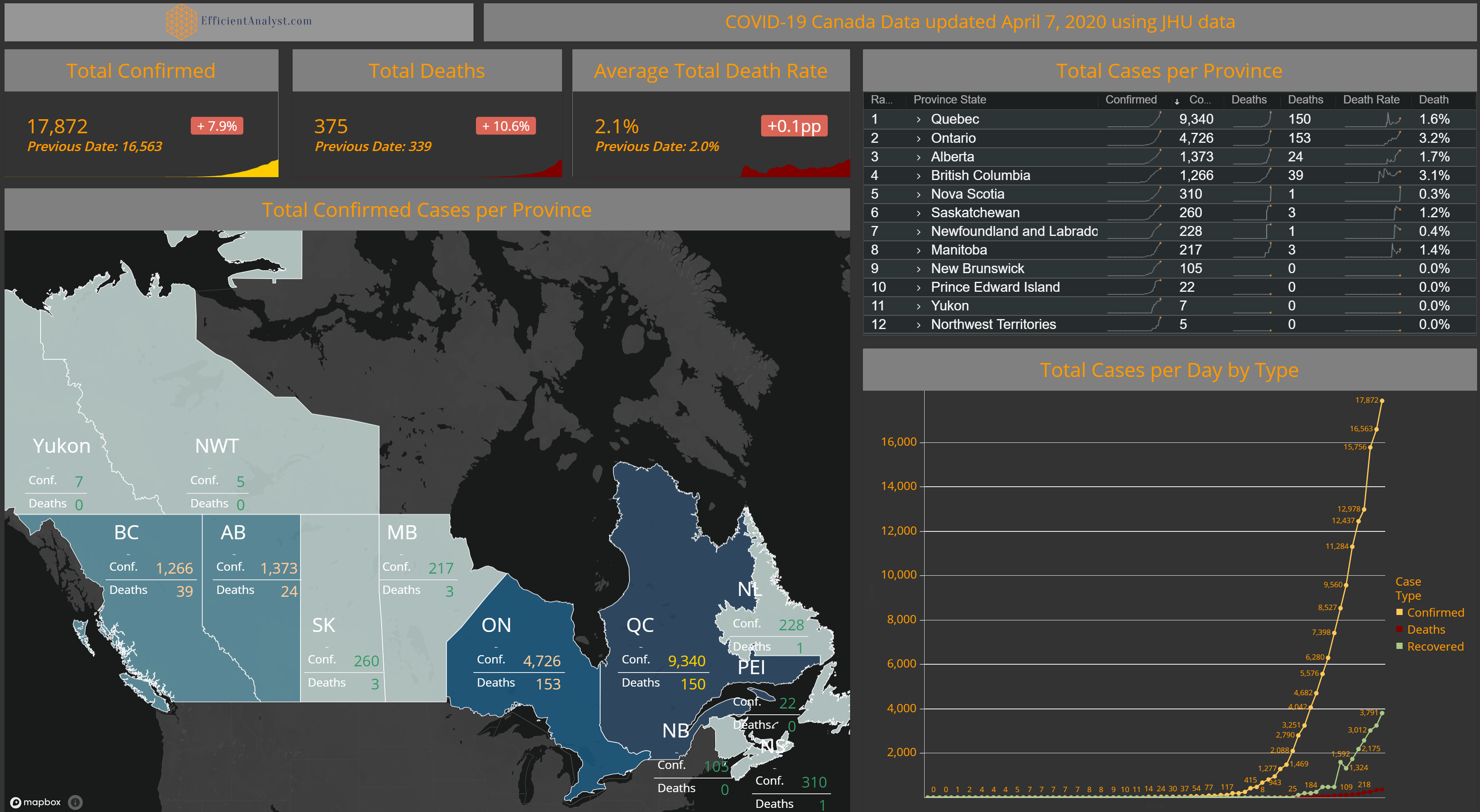
COVID-19 Canada April 7, 2020 update
COVID-19 Canada April 6, 2020 update
